Calligraphy Series (2016)
We are fascinated by how we write language. Calligraphy is a particularly
powerful and beautiful embodiment of writing. Inspired by an invitation
to participate in the Sharjah Calligraphy Biennial, Seventh Edition
(held in Sharjah, United Arab Emirates, in April 2016),
we created several folded-paper sculptures and prints.
All pieces incorporate a theme of the Dot (a theme present throughout the
Biennial), and use a combination of English and/or Arabic to illustrate
artistic interpretations of calligraphy.
The message throughout our pieces is that Calligraphy creates
Art Through Words, so those phrases appear throughout our work.
Folded-Paper Sculpture
The following sculptures are folded from multiple sheets of paper
in the shape of circular dots, with small holes in the center.
The paper is folded along concentric circular creases, further representing
the dot as well as the mathematical challenge of curved-crease folding.
Each sheet is printed with matching circular patterns of text/calligraphy.
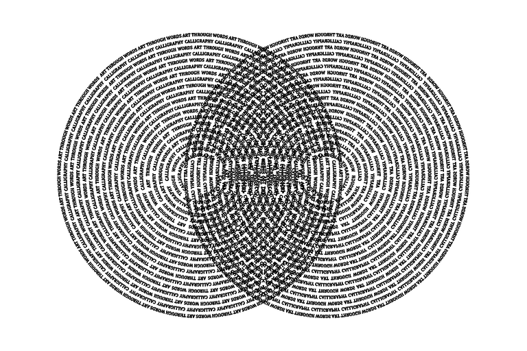
The first piece is bilingual, with each circle alternating
between an English script font and Arabic Ruqʿah calligraphic script.
Half of the sheets write “Calligraphy” /
 ,
and the other half of the sheets write “Art Through Words” /
,
and the other half of the sheets write “Art Through Words” /
 .
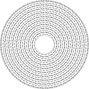
The second piece is in English, with each circle alternating
between “Calligraphy” and “Art Through Words”.
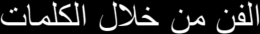
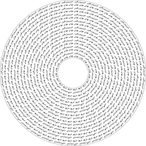
The third piece is in Arabic, in the Ruqʿah calligraphic
script, with each circle alternating between
and
.
.
The second piece is in English, with each circle alternating
between “Calligraphy” and “Art Through Words”.
The third piece is in Arabic, in the Ruqʿah calligraphic
script, with each circle alternating between
and
.
[0531] “Art Through Words I” (2015), Mi-Teintes paper, 8" × 8" × 12" high resting on 18" × 18" print:


[0532] “Art Through Words II” (2015), Mi-Teintes paper, 7" × 10" × 9" high resting on 18" × 18" print:


[0533] “Art Through Words III” (2015), Mi-Teintes paper, 7" × 11" × 9" high resting on 18" × 18" print:


Original Sheet of Paper
Here is the printed pattern on the sheets of paper for each of the three
sculptures above.
They represent the dot and the harmony between the different messages and languages.
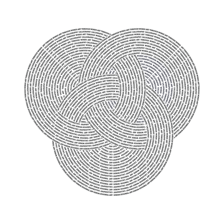
Individual Components
Here is the “three-dimensional dot” that each of these sheets
of paper folds into. Several of these components are assembled into the sculptures above.


Each three-dimensional dot is manipulated into different forms to form the
folded-paper sculptures. For example, the following form shows a transition
from the English rings being visible to the Arabic rings being visible.

Changing Piece
The following piece is designed to be re-assembled differently each
time it is set up. The philosophy is that
language and ideas change over time.
[0537] “Morpheus” (2016), Mi-Teintes paper, 28" × 24" × 20" high:

Multiple Dot Prints
These prints experiment with composing multiple dots of concentric circular
words similar to the examples above, but with different fonts.
(In fact, they are based on an earlier version of the design for folding.)
These represent the combination/merging of multiple dots.
“Two Dots” (2015), archival print, 36" × 24" tall:

“Reflective Dots” (2015), archival print, 36" × 24" tall:
“Borromean Dots” (2015), archival print, 36" × 36" tall:
Mathematical Font Prints
We have developed two fonts that incorporate mathematics, geometry, and dots:
conveyer belts and glass cane.
For each font, we prepared two 24" × 36" prints,
one with a message and one illustrating the font.
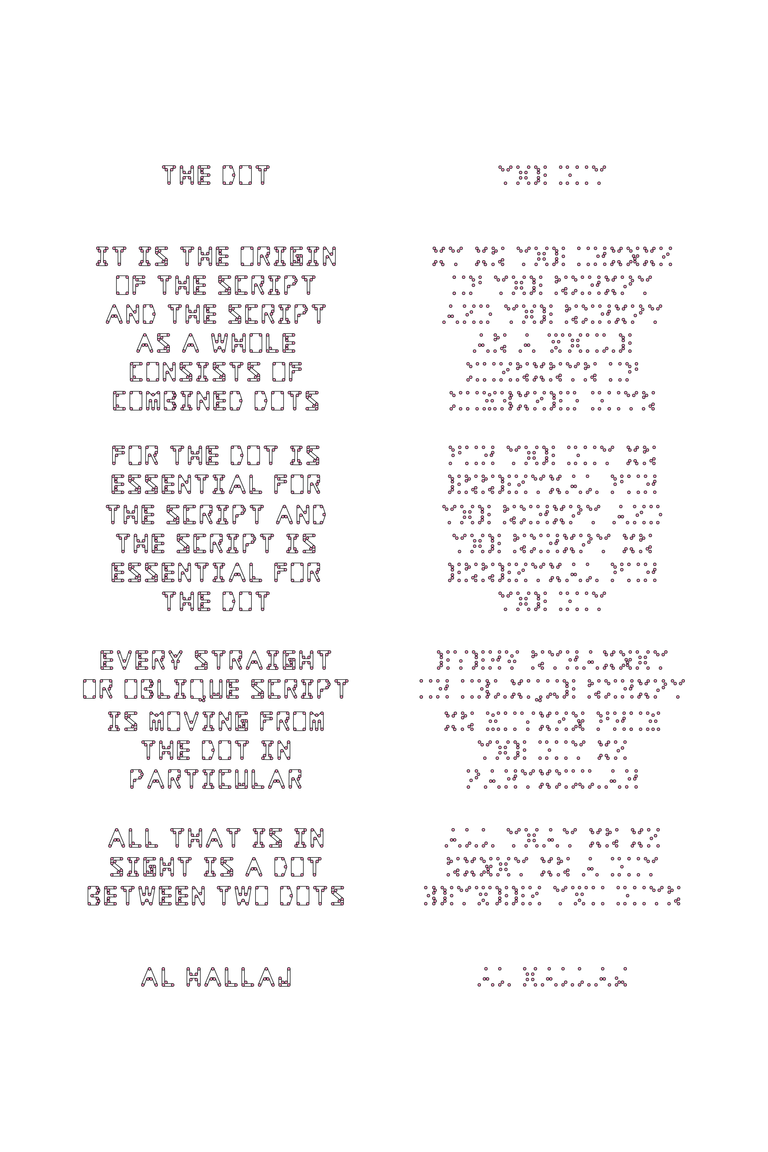
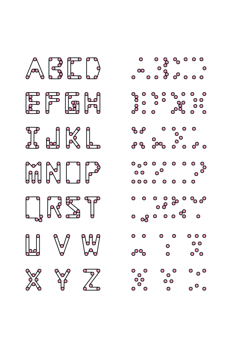
Conveyer Belt Font
The first font is the Conveyer
Belt Font, which has two forms. The form on the right is a mathematical
puzzle: for each pattern of dots, the goal is to draw a single noncrossing
taut belt that touches all the dots, so that moving the belt would turn all
the dots. The form on the left shows the solution, which is easy to read.
The first print is based on the quote by Al Hallaj about The Dot.
The second print illustrates the font.
“The Dot in Dots” (2015), archival print, 24" × 36" tall:
“Dot Alphabet” (2015), archival print, 24" × 36" tall:
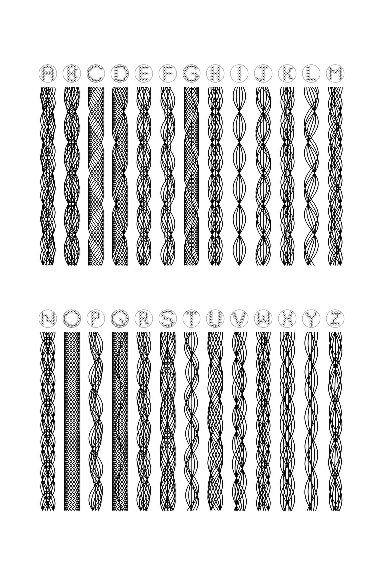
Glass Cane Font
The second font is the Glass Cane
Font, which again has two forms. The top view shows an English letter
formed by an arrangement of dots. The side view shows what happens if long
black lines representing each dot are pulled and twisted in a circular fashion.
These intricate geometric patterns represent glass cane, which could be made
by glass blowers from clear and black glass.
The first print is based on our message that Calligraphy creates
Art Through Words. The second print illustrates the font.
“Glass Calligraphy” (2015), archival print, 24" × 36" tall:
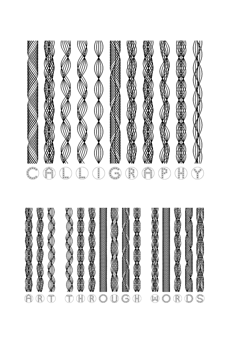
“Glass Dot Alphabet” (2015), archival print, 24" × 36" tall:
Acknowledgments
This artwork was inspired in part through discussions and collaboration with
Mahmoud Ghulman and Mohammad Ghulman.