Tetris Font | by Erik Demaine and Martin Demaine, 2020 |
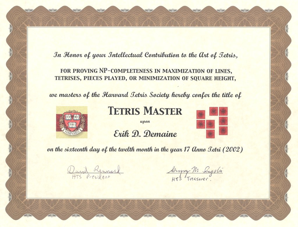
Tetris is among the best-selling (and perhaps best-known) video games ever. We grew up playing the Game Boy and Spectrum HoloByte PC editions. Erik is even a Tetris Master. Nowadays you can play in your browser or on a Switch or on PS4/PC/VR.
Font design. Each letter and digit in this typeface is made up of exactly one of each of the Tetris pieces: (I), (J), (L), (O), (S), (T), and (Z). Furthermore, the letter is designed so that it can actually be constructed by stacking these pieces one at a time and be supported by previous pieces, as in Tetris. These designs were found by hand, aided by the BurrTools software which enabled searching for whether the Tetris pieces could fit inside a candidate outline for a letter. The piece colors roughly follow The Tetris Company's standard colors, or you can switch to black pieces. The initial rotations follow the standard Super Rotation System.
Puzzles. In the puzzle font, the letters are at the correct rotations and horizontal positions, and their vertical position represents their drop sequence. Drop the pieces in your head (or via animate) to figure out what letter is encoded. • Even without puzzle font turned on, in the animated font, you can try to guess what the letter is before all the pieces have arrived. • One final set of puzzles: In the unanimated unpuzzle black-pieces font, try to figure out how one of each Tetris piece perfectly packs that shape. (This is the task that BurrTools is very good at.)
Related mathematics. (Perfect-information) Tetris is NP-complete, meaning that it's computationally intractable to figure out whether you can survive, or clear the board, given an initial board configuration and a sequence of n pieces to come. Similar results hold for k-tris played with k-ominoes instead of tetrominoes. Most recently, we analyzed the complexity of Tetris with few rows or columns; this font appears in that paper.
Acknowledgments. This font was inspired by a collaboration with Alex Streif and Kate Jones of Kadon Enterprises during BRIDGES 2017, where we started designing a font using just 5 pieces: the “free tetrominoes” where S is the same piece as Z and J is the same piece as L. Relatedly, Kate Jones designed other polyomino fonts included in some Kadon manuals. By contrast, this typeface aims closer to the rules of Tetris, where reflection matters and the pieces must stack and be supported.
Check out other mathematical and puzzle fonts. • Feedback or not working? Email Erik. • Source code on GitHub.